Work and organisations
Icon keylines (24 dp grid, Material Design system icons)
Icon keylines: what is matched is the size the eye sees
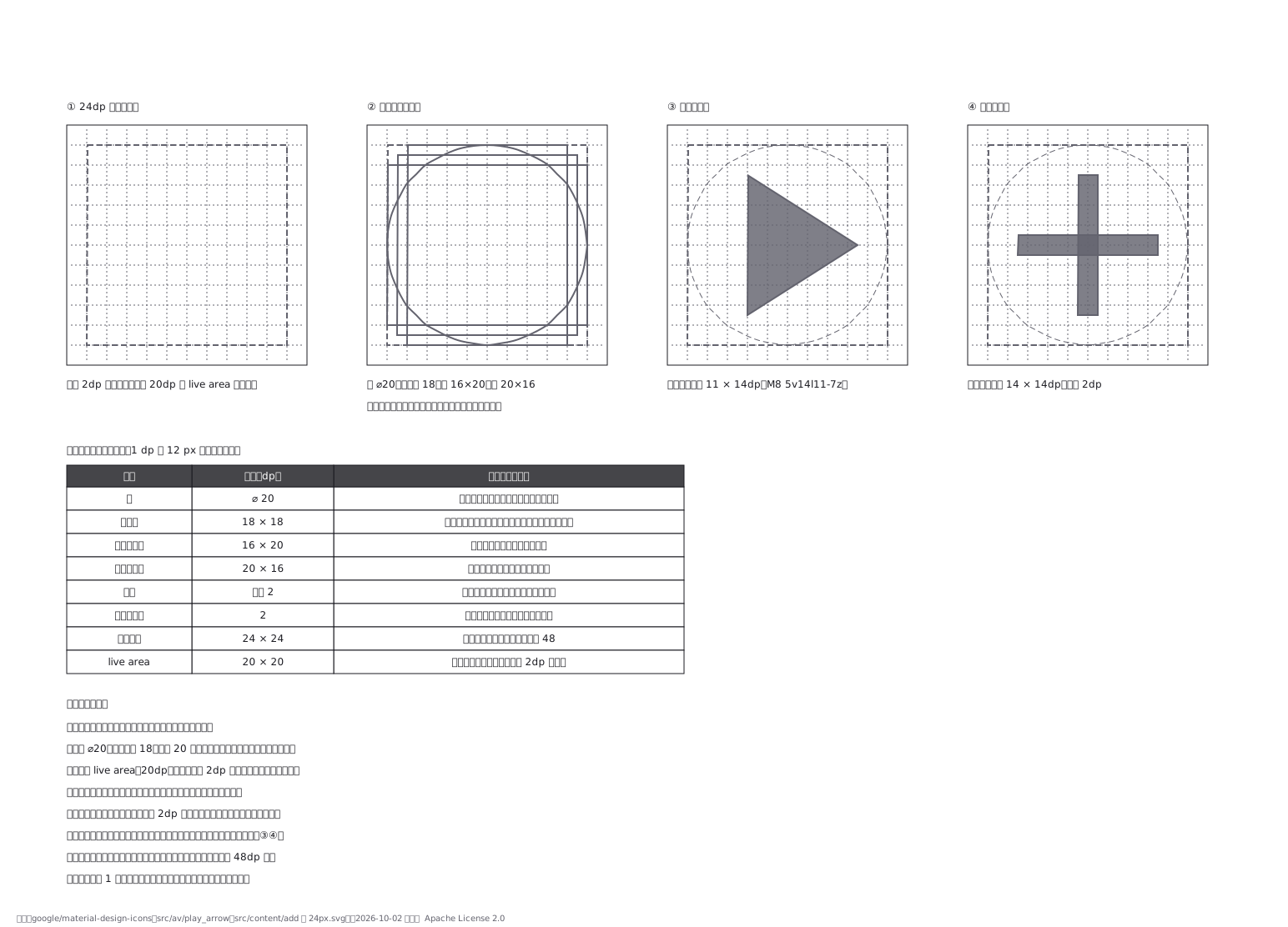
This drawing comes from one YAML file. No shape was moved by hand.
Notes in the source (in Japanese)
寸法の数字を揃えない。揃えるのは「見えた大きさ」。
円は ⌀20、正方形は 18 × 18、縦長は 16 × 20、横長は 20 × 16。同じ 20 にすると、正方形のほうが大きく見える ——四隅まで面があるぶん、目には大きく映るため。
グリッドは 24 × 24 dp、中身は 20 × 20 dp の live area に収める。外周 2dp は、切られても困らない余白。
角丸は外側の角だけ(内側を丸めると太さが痩せて見える)。線でできた記号はストロークを 2dp で揃える。キーラインは上限であって、全部をいっぱいに描くわけではない。実物のシステムアイコンでは、再生(play_arrow)の三角は 11 × 14dp(パス M8 5v14l11-7z)、追加(add)の十字は 14 × 14dp・太さ 2dp(M19 13h-6v6h-2v-6H5v-2h6V5h2v6h6v2z)。出典:google/material-design-icons の src/av/play_arrow・src/content/add の 24px.svg(https://github.com/google/material-design-icons 、Apache License 2.0、2026-10-02 照合)。
アイコンは 1 つずつ作らない。 キーラインの上で、一式として作る。
Source (YAML)
examples/gallery/123-アイコンのキーライン図.zumen.yaml
More in this field
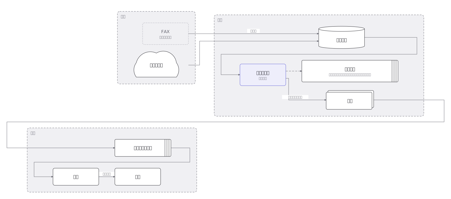 From order to shipment: credit check, stock allocation, picking instruction, packing and despatch, with the owner of each step
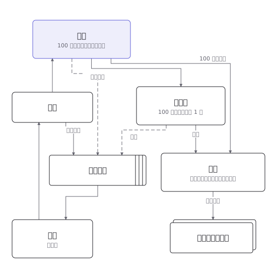 The route a written proposal takes through each rank of approval, including the conditions that send it back
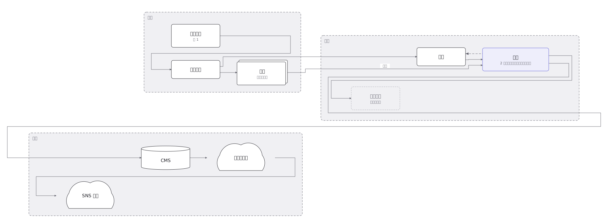 How an article gets made — commissioning, interview, writing, subediting, typesetting, publication — and the loops back when it is sent for rework
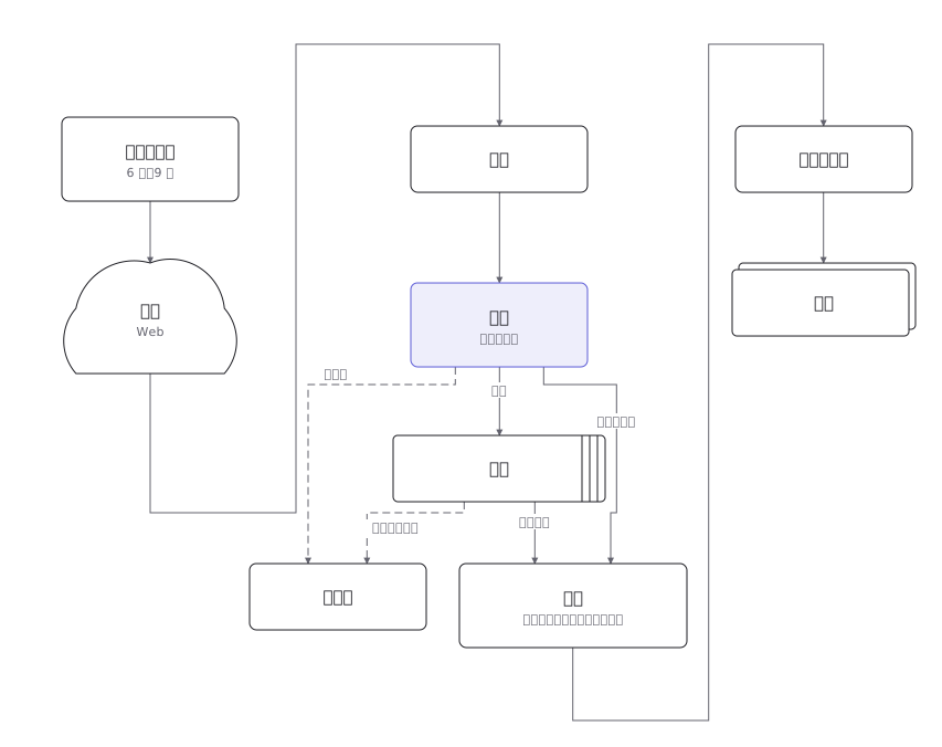 The path from application to enrolment — examination, results, admission procedures — with the deadline on every step
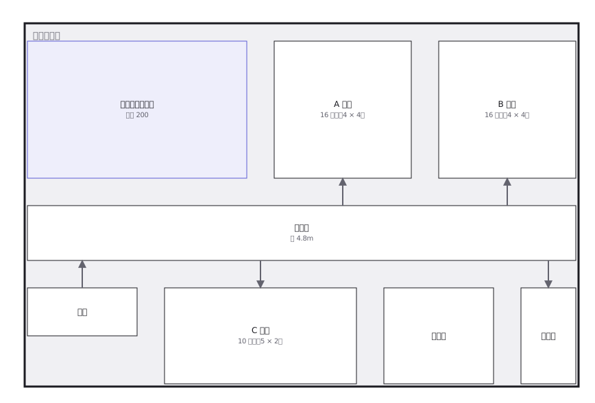 An exhibition hall divided into booths, with aisle widths and the position of reception, meeting space and the goods entrance
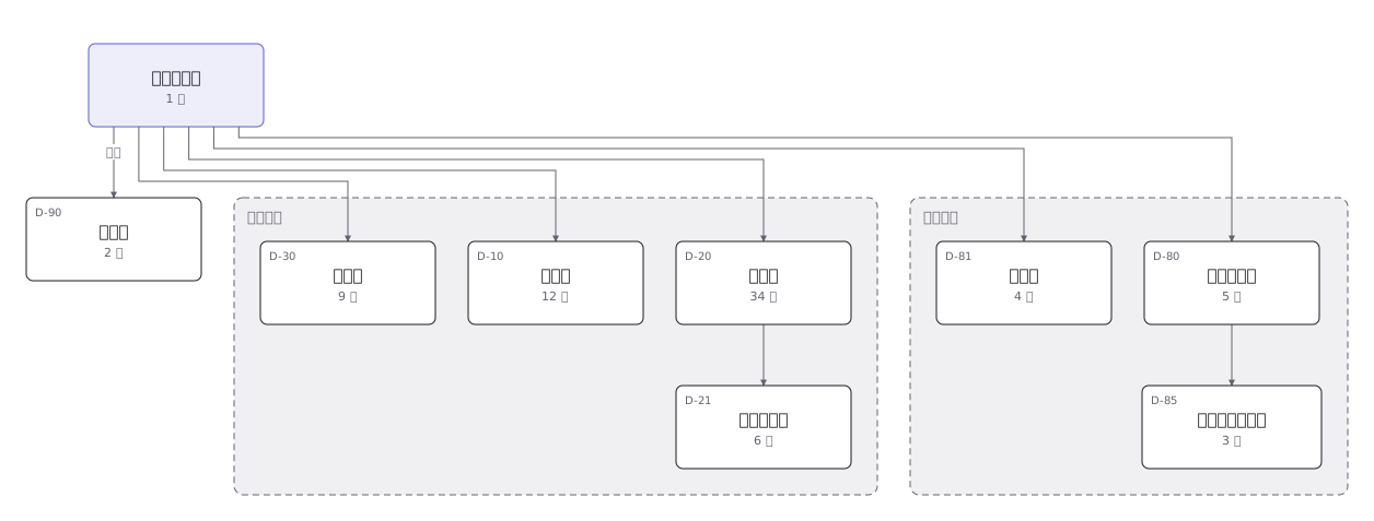 A company organisation chart down to section level, with headcount and remit written on each box
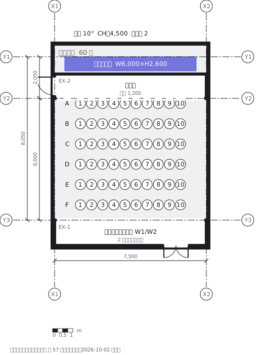 Seating plan, sixty seats and two wheelchair spaces
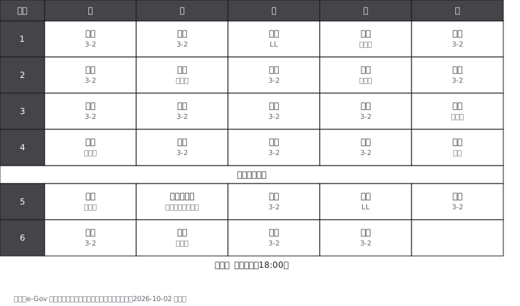 A lower secondary school week: periods down the side, days across the top, and the subject, room and teacher in each cell