UI and screen design
E-commerce product page UI structure (Desktop 1440 / Mobile 390, with responsive differences)
Product page structure, desktop against mobile
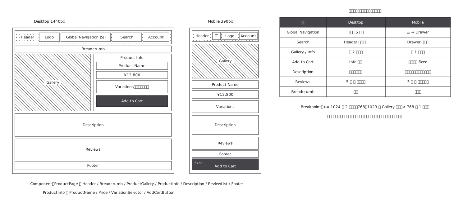
This drawing comes from one YAML file. No shape was moved by hand.
Notes in the source (in Japanese)
完成デザインではなく UI 構造の正本。色も書体も装飾も持たない。表しているのは「何が・どこに・どの順で・PC と SP でどう変わるか」だけ。
右の表が主役 —— 絵を 2 枚並べるだけでは、何が変わるか言えない。レスポンシブは縮小ではなく構造の変化(横並び→縦並び、Nav→Drawer、下部固定)。
Source (YAML)
examples/gallery/74-EC商品ページのUI構造.zumen.yaml
More in this field
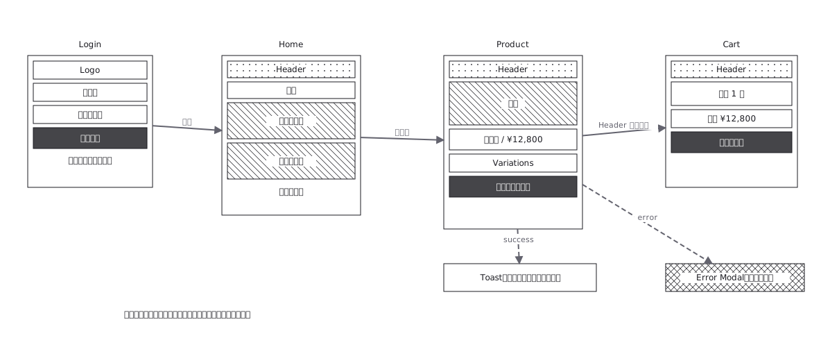 Screen flow with the wireframes drawn in
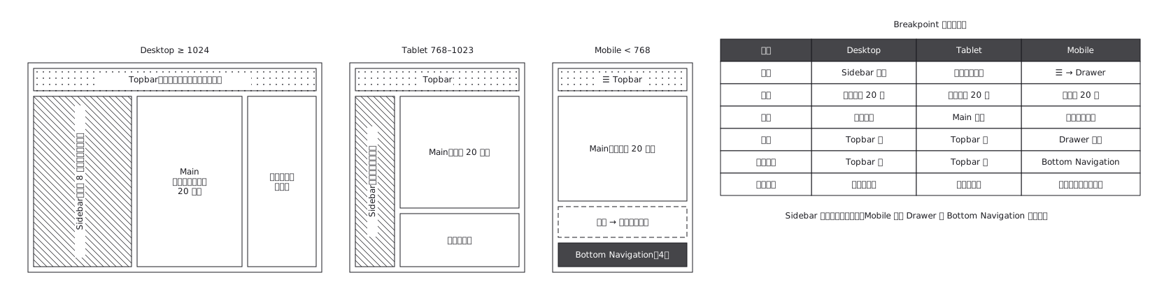 The same admin screen at desktop, tablet and mobile, where the sidebar turns into a drawer rather than simply shrinking
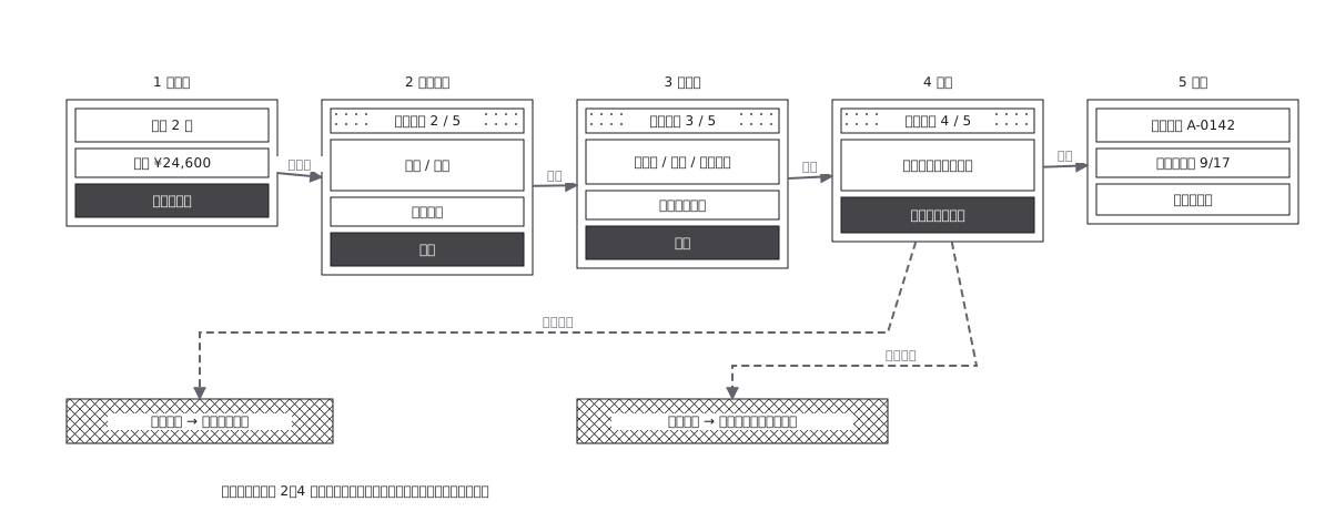 Checkout flow, five steps and where errors return to
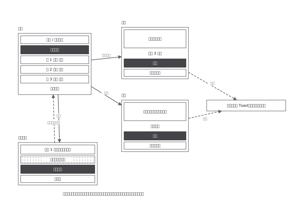 CRUD admin flow: delete goes through a confirmation
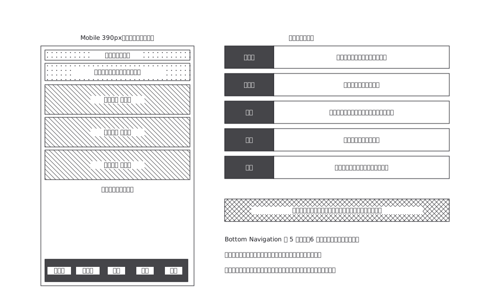 A mobile app with five bottom navigation tabs, and what each tab holds and where it can go from there
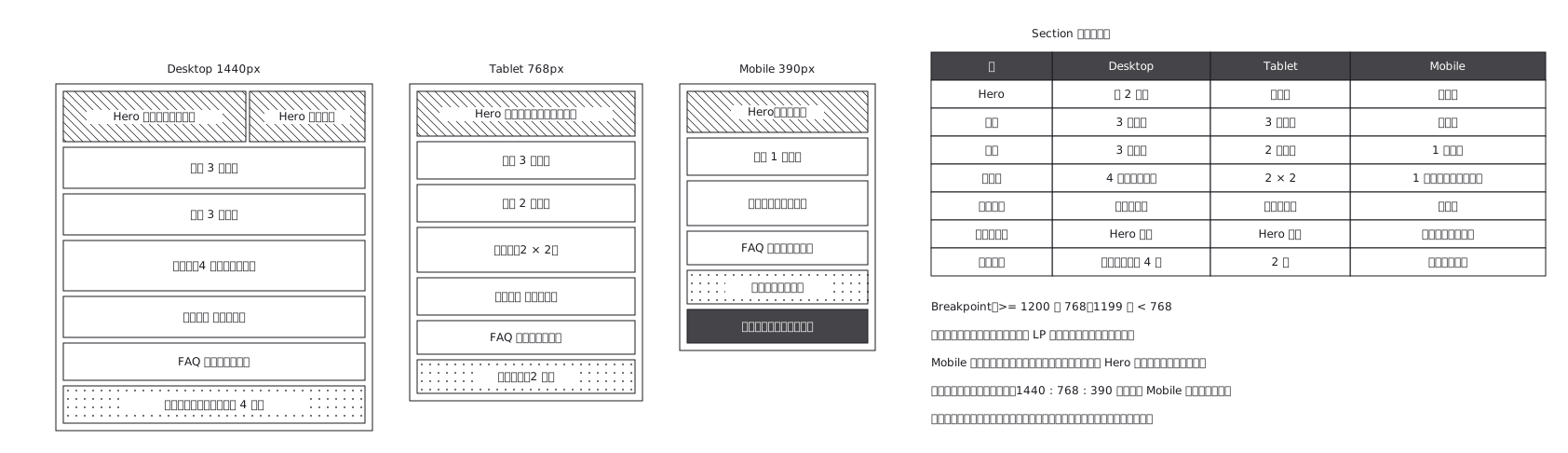 Landing page where sections appear and disappear
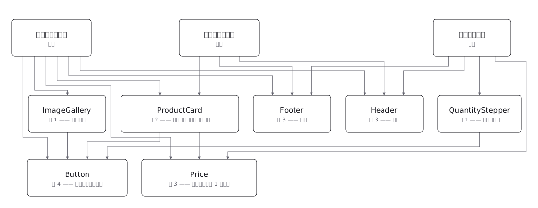 Draw a component tree per screen and the same component keeps reappearing; the real structure is a net, where one component has several parents — and counting those parents is how you tell a shared component from a screen-specific one before you change it